The App
You know what? There’s a lot of parking apps out there, and they all have great features. But great features don’t always minimize the stress of DTLA traffic at 5 pm.
PARK/DTLA offers a simple, clear answer when you need it. It takes care of deciphering parking signs and meter payment, so you can focus on the important things, like driving.
The Inspiration
Having recently moved to Los Angeles, the first thing I noticed was well, people drive, a lot. Now that I drive a lot, I’ve also noticed this:
The Project
PARK/DTLA is a project I created to explore my newly learned UX design skills. My challenge for the project was to take a hard look at existing parking apps, and design a new interface based on my experience and research.
My goal was simple: make it simple.
Parking apps should be easy to use and ideally hands free, errr read: it’s against the law to use a phone while driving. That said, I struggled to find an app that was both easyto navigate and included payment services.
This got me brainstorming…

The Brainstorm
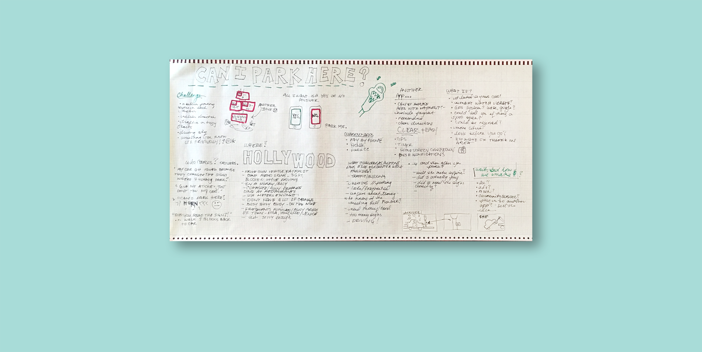
I began by creating my brainstorm map… a few drawings and free flow of ideas, some interviews and competitor research helped me boil down what was most important about creating the PARK DTLA app.
The Discovery
My brainstorming needed some support and structure, so I focused on interviews, competitor research, and business needs.
I interviewed fellow LA residents, and used their input to narrow down my primary personas. Developing profiles and understanding the needs of my future users helped to decipher what key features were most important. I often asked myself, “How would Brittany interact with this? or “what does Richie need most when he’s parking and running late?” These questions of course lead to more questions and research, but in the end really provided a great filtration system for my design decisions.
In addition to the interviews, I also charted features provided by potential competitors. There are some great apps out there, and I now have more parking apps then cars I’ll own in a lifetime, but my research showed that there is still a need for an easy framework that makes parking and payment simple.
From a business point of view, I needed to define what simple meant for this app, as well as have a few moneymaking ideas to make the app successful.
So how did I define simple?
Less steps, less pages, less decisions, less distractions
And the moneymakers?
I looked at how other apps were making money, and found that they use things like advertisements, charge for download/subscription, or charge for services. I ruled out ads because they do not pass the simplicity filter, and decided on charge for services. PayByPhone charges about 30 cents to pay for metered parking, something that will add up, but users will gladly pay for the convenience.
Finally, identifying the hierarchy of features and user needs allowed for a focused approach moving into creating the structure and design of the app.
The Structure
Next, I created the framework for PARK/DTLA. The primary personas, competitor research, and business goals made for easy editing of the initial framework.
The Design Evolution
After deciding the framework met the needs of my users and the needs of my business, I began sketching designs for the app.
Final Ready for Testing
A few rounds later, Park DTLA is ready for testing and some user feedback.


